Welcome back 🙂
It’s time to talk about one of the most ‘famous’ issues of Power BI. It appears when you have parent-child or cascading slicers in your report. Let’s say, you have a parent slicer ‘Category’ and a child slicer ‘Sub-Category’. When you change a selection in Parent, child selector doesn’t change to any default selection (corresponding to newly selected category) and as a result of this wrong combination in selection, charts and tables get blank. Have a look at the following screenshot. Nothing wrong with the report at this moment:

Now, I am changing the ‘Category’ slicer to a different category called ‘Devices’. And blank it goes..

It’s because, sub-category doesn’t switch to any default selection when category was changed. ‘Spray’ sub-category remains selected although it doesn’t belong to newly selected ‘Device’ category. Ideally we would have liked to see the sub categories of ‘perfume’ category getting selected automatically.

As soon as we select correct sub category from ‘Device’ category, charts get plotted again:

So, that was all about the problem. Now, let’s talk about the solution.
Hierarchical Slicer
Luckily, Microsoft has introduced something called ‘Hierarchical Slicer’. If you put multiple columns in ‘field’ area, normal slicer becomes hierarchical slicer.
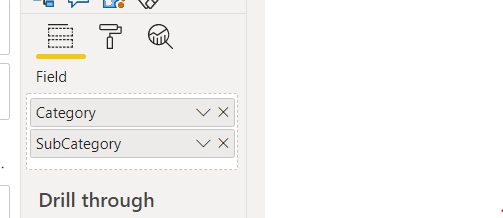
This is how it looks in report:

Changing parent categories doesn’t cause any issue at all. Charts get plotted nicely:

Workarounds when you aren’t able to use hierarchical slicer
In one of my projects, I had to avoid using hierarchical slicer. So I had to try some dirty workarounds to avoid seeing blank charts. Following are the steps I followed to come up with an alternative:
First, replace the child slicer with some visual. In my case, I replaced the classic slicer with Matrix visual. I have put sub-category field in ‘columns’ section of the Matrix visual and did some cosmetic changes to give it a more filter like look.

Advantage of using a visual instead of slicer is, when you change parent category, sub category filter updates itself. So, you don’t end up showing a wrong selection in sub category filter. But, still you get a blank chart 😦

After changing the parent category to ‘Perfumes’, you will see something like this:

I have highlighted a green rectangular box at top-right. It’s showing an alert message to the user asking them to select at least one sub-category. It’s very easy to create a DAX measure to show this kind of notification. All you have to do is to create a measure and put it into a card visual. I have demonstrated it in following image:

Coming back to ‘chart getting blank’ issue, we can avoid this blank behavior if ‘interaction’ of the sub-category filter (now a matrix visual) is set to ‘highlight’ instead of ‘filter’. That means, if you select the sub-category filter and select ‘Edit Interactions’ in ‘Format’ tab, you would be able to select whether the sub-category filter has an ‘highlighting’ effect or a ‘filtering’ effect in the bar chart and tree map at the bottom.

Let’s choose ‘highlight’.
Now, you will see some change in ‘blank’ behavior. Whenever parent filter is changed, charts show a non-highlighted state. Better than some unwanted blanks.. eh?

After changing the parent…

Things get ‘more’ normal once you properly select some sub-category:

It’s far from an ideal solution but probably a better solution than ‘all of a sudden blank’ and a ‘wrong sub-category’ that we have described at the very beginning of this post. However, your client has to agree on showing ‘highlighting’ effect instead of showing ‘filtering’ effect. And, your charts and graphs have to support ‘highlighting’ effects. Not all visuals support ‘highlight’ in Power BI.
